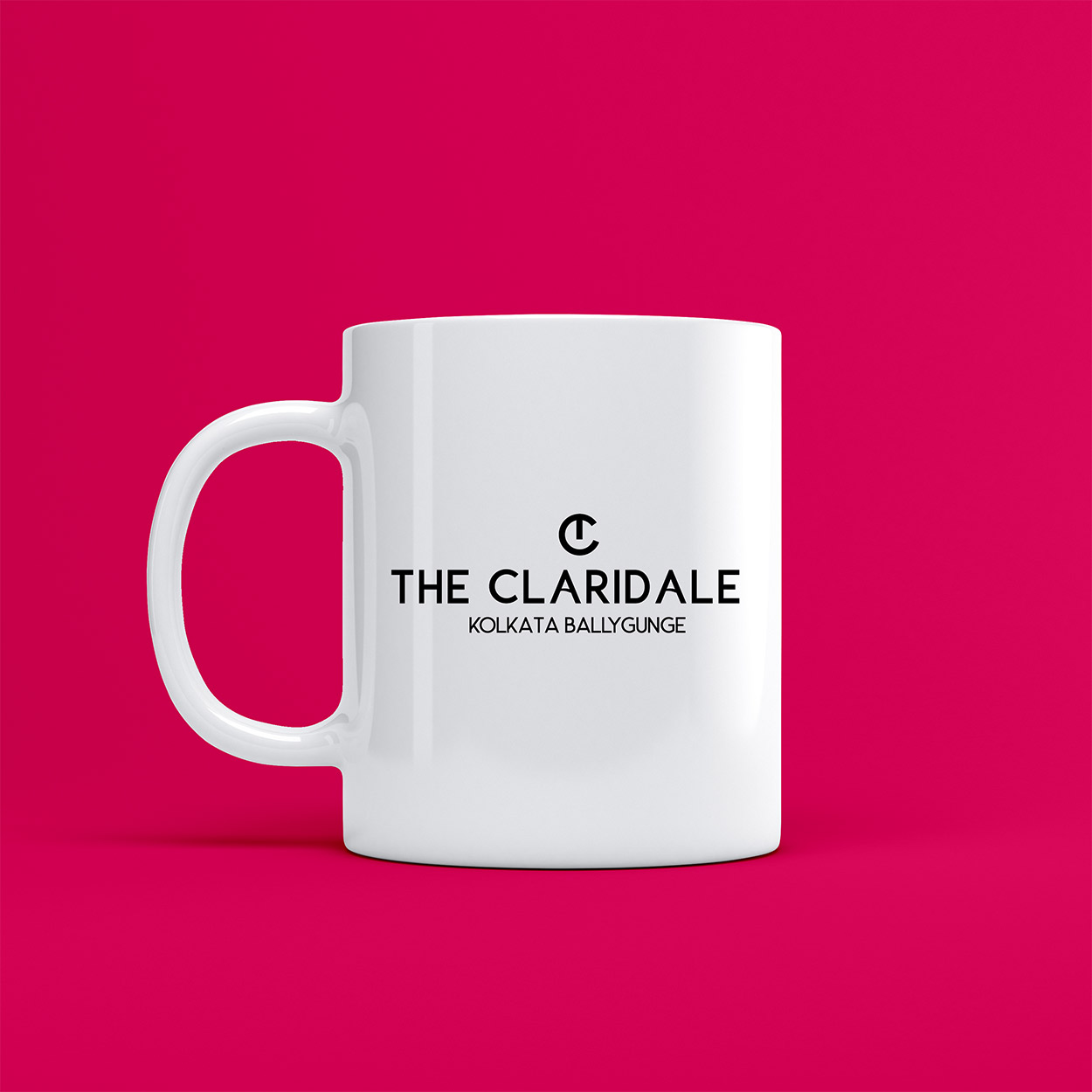
The Claridale, Kolkata
Year
2021
Deliverables
- Brand Name
- Brand Identity
Before this swanky luxe hotel in the heart of Kolkata opened its doors to the world, they opened their hearts to us about the kind of brand image they desired to create. Minimalist yet chic. Accessible luxury with the warmth of home but all the decadence of a glitzy hotel in the hub of the city.
We wanted the hotel’s name had to have the “3M quality”, namely: Modern, Minimalist, Memorable. When we conceived “The Claridale” it checked all the above three characteristics. Moreover, it synchronized beautifully when paired with “Kolkata”.
The Claridale, Kolkata was catchy, elegant, and quintessentially captured the essence of our city’s old-world charm blended with a modern twist. Much like the property itself.
Brand Name & Identity